Radius vs ZIP vs Polygon: Three Geographic Targeting Models
Every local platform picks one of three ways to define a service area. Nextdoor migrated its paid product off polygons onto radius-derived ZIPs. Here is why.

Every platform that sells local demand has to answer one question before it can sell anything: what counts as "here"? There are only three answers in wide use. A radius (a center point plus a distance), a ZIP list (a set of discrete named areas), or a polygon (a drawn or pre-drawn boundary). The most instructive data point is Nextdoor, which owns the richest neighborhood-polygon dataset in consumer tech and still moved its paid advertising product off polygons and onto a radius that resolves down to ZIP codes, per its own Local Deals transition page.
TL;DR
- Three models exist and each platform picks one. Indeed and Yelp use radius, Angi uses ZIP lists exclusively, and Zillow treats a ZIP as a region polygon rather than a center point plus distance.
- Nextdoor migrated its paid product from neighborhood polygons to a radius slider capped at 30 miles, and converted legacy targeting "from neighborhoods to the ZIP codes those neighborhoods were within" (Nextdoor).
- Google Ads sets a 1 km / 1 mi minimum radius and describes it as a privacy floor, with a limit of 500 proximity targets per campaign (Google Ads Help).
- Yelp's Fusion API caps radius at 40,000 meters (about 25 miles) and documents it as a suggestion rather than a hard cap, returning a
distancefield in meters (Yelp). - Angi has no radius control anywhere in its pro tooling. Coverage is ZIP-only, selected per service, and the screen is read-only for pros on a Subscription or with more than one coverage area.
The three models, side by side
The differences look cosmetic in a settings screen and turn out to be structural once you follow them through to billing, reporting, and dispute handling. A radius is a continuous value, so it can be nudged by a slider and it never needs a lookup table. A ZIP list is a set of discrete keys, so it can be joined against a spend record, an invoice line, or a lead export. A polygon is a shape, so it renders beautifully on a map and behaves badly the moment you try to charge someone for it.
Radius platforms tend to expose the value directly in the API. Indeed's client libraries document a default of 25 miles, measured "as the crow flies," which is the giveaway that the model is pure Euclidean distance with no road network involved (indeed-python). Yelp does something similar in meters and adds sort_by=distance, which only makes sense when distance from a center point is a first-class property of every result. Google Ads sits at the sophisticated end, offering miles or kilometers in whole numbers with a documented minimum of 1 km / 1 mi framed as a privacy floor.
One quirk in the Google case is worth flagging because it trips people up. A maximum radius of 1,242 mi / 2,000 km is documented in Google Studio Help (article 7279179), not in Google Ads Help, which documents no maximum at all. If you are writing a validator against the advertising product, you are validating against a number that the advertising documentation does not actually publish.
ZIP-list platforms behave differently. Angi asks pros to tap ZIPs on a map or type a city or ZIP and pick from the results, and it scopes the selection per task or service rather than per business. There is no documented cap on how many ZIPs a pro can hold. What Angi does document is friction: the screen is read-only for pros on a Subscription or with more than one coverage area, requiring a phone call to 877-947-3639, and changes take overnight to apply. That combination is what a ZIP list looks like once it is load-bearing for billing.
| Platform | Model | Detail | Source confidence |
|---|---|---|---|
| Indeed | Radius | Free numeric radius, default 25 miles, "as the crow flies" | High (official client libraries) |
| Google Ads | Radius | Miles or km, whole numbers, 1 km / 1 mi minimum as a privacy floor, 500 proximity targets per campaign | High (Google Ads Help); the 1,242 mi max is documented in Studio Help only |
| Yelp Fusion API | Radius | Meters, max 40,000 m (about 25 mi), documented as a suggestion; returns distance, supports sort_by=distance |
High (official API reference) |
| Nextdoor Ads | Radius | Slider, maximum 30 mi, replaced neighborhood targeting | High (Nextdoor transition page) |
| Thumbtack | Radius or ZIP list | Mile radius as one option among several; ZIP lists as an alternative | Medium on the 150 mi cap (community thread with staff participation, not an official help doc) and on the 1,000-ZIP bulk CSV limit (user-pasted product error string) |
| Angi | ZIP list only | ZIPs tapped on a map or searched by city/ZIP, selected per task, no documented cap, overnight application | High (Angi Help Center, "How to Update Your Service Locations") |
| Zillow | Polygon | No numeric radius filter found; a ZIP is treated as a region polygon, plus map-bounds targeting and a "Draw" custom boundary with "Remove Boundary" | High (product surface) |
| Nextdoor organic | Polygon | Nextdoor-drawn neighborhood boundaries; "Nearby Neighborhoods" auto-linked by a distance-based algorithm | High (Nextdoor product docs) |
Radius: intuitive to a human, wrong at the edges

The reason radius keeps winning product decisions is that it is the only model a business owner can reason about without a map in front of them. Ask a plumber how far they travel and you get a number in minutes or miles. You do not get a list of postal codes, and you certainly do not get a shape. A slider that goes from 5 to 30 miles matches the mental model already in the owner's head, which means onboarding completes and the campaign starts spending.
It is also the cheapest model to implement. A center point and a scalar require no boundary dataset, no licensing agreement with a geodata vendor, no annual refresh when jurisdictions redraw themselves. The distance calculation is a formula. Indeed's "as the crow flies" phrasing is refreshingly literal about what that formula does and does not account for.
What it does not account for is everything that makes travel expensive. A circle over-includes across a river with no bridge, across a mountain, across a controlled-access highway with no exit for six miles, and across a state line where licensing rules change. It under-includes along the interstate, where a 40-minute drive covers 35 miles of genuinely reachable customers who fall outside a 25-mile ring. Anyone who has run local ads in a coastal or mountain city has watched a meaningful slice of budget land on the wrong side of a physical barrier.
The minimums and maximums each platform picks tell you what they are protecting. Google's 1 km / 1 mi floor is explicitly a privacy measure, since a radius small enough to identify a single household stops being targeting and starts being surveillance. Yelp's 40,000 m cap is documented as a suggestion, which is an API author's way of saying the number is a performance guardrail rather than a semantic boundary. Nextdoor's 30 mi ceiling reflects a product that is deliberately local and does not want a regional advertiser buying the whole metro through one center point. Thumbtack's reported 150 mi cap is a different animal entirely, and the number should be handled with care: it comes from a community thread with staff participation rather than from the official help article, which states no number at all (Thumbtack).
The 500-proximity-target limit in Google Ads is the quiet admission that radius does not scale to complex territories. Once a business needs more than a handful of circles to describe where it works, the model is being used as a crude polygon approximation, and each additional circle adds overlap that has to be deduplicated somewhere in reporting.
ZIP lists: discrete, auditable, and not actually market boundaries
ZIP codes have one property no other model can match: they are keys. A ZIP is a short string that both parties agree on, that appears in a CRM record, that a customer can read off an invoice, and that a support agent can look up during a dispute. When a pro asks why they were charged for a lead, "because 78745 is on your list" is a sentence that ends the conversation. Neither a radius nor a polygon produces a comparable sentence without a computation the customer cannot verify.
That auditability is why ZIP lists cluster around platforms with per-lead or per-service billing. Angi's model is the purest example in the research, since it has no radius control anywhere in its pro tooling. Coverage is chosen per task, which means a pro can serve a wide area for a high-ticket service and a narrow one for something with thin margins. That is real expressive power, and a radius cannot represent it without one circle per service.
The cost shows up in the workflow. Selecting a service area one ZIP at a time is tedious in a way a slider never is, which is presumably why Thumbtack supports bulk CSV upload for ZIP lists. The reported cap there is 1,000 ZIPs per upload, and the provenance matters: that figure comes from a product error string a user pasted rather than from any help documentation, so treat it as medium confidence and verify before building against it.
The deeper problem is conceptual. ZIP codes are postal delivery routes. They were designed to make mail carriers efficient and they are maintained by an organization with no interest in market boundaries. They vary enormously in size, from a few blocks in dense Manhattan to hundreds of square miles in rural Nevada, so "20 ZIP codes" describes a wildly different market depending on where you are standing. Some ZIPs are single buildings. Some are point codes for a PO box facility with no residential population at all. And they change, which means a saved list quietly drifts out of alignment with the territory it was meant to represent.
Angi's operational friction is the other tell. Read-only screens for Subscription pros and pros with multiple coverage areas, a phone number to make changes, and overnight application are the signatures of a value that is wired into contracts and billing rather than treated as a display preference. That rigidity is a cost, and it is also the reason the model is trustworthy for money.
Polygons: the most faithful model and the hardest one to run
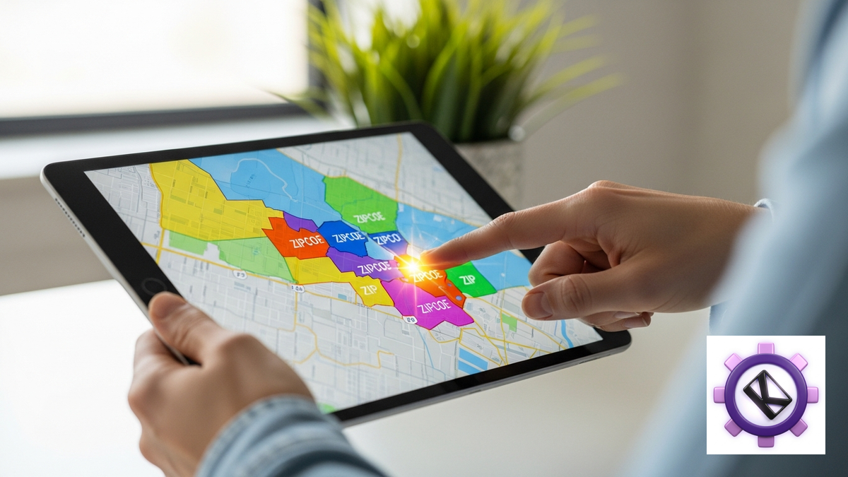
Polygons are what everyone wants when they first think about the problem. Real neighborhoods have names, edges people agree on, and identities that show up in how residents talk about where they live. A shape that follows the river, the rail line, and the school catchment describes a market far better than a circle drawn around a pin.
Zillow leans into this. The research turned up no numeric radius filter at all. A ZIP in Zillow behaves as a region polygon rather than a center point plus a distance, and the product adds map-bounds targeting and a "Draw" custom boundary with a "Remove Boundary" control for undoing it. That set of affordances only makes sense for a category where the boundary itself is the product. In residential real estate, "which side of the street" is a price difference, so approximating with a circle would destroy the thing being sold.
Nextdoor's organic layer is the other serious polygon implementation. Neighborhoods are Nextdoor-drawn, and "Nearby Neighborhoods" are linked by a distance-based algorithm that, in Nextdoor's own words, "automatically connects your neighborhood with the neighborhoods that are closest." New nearby neighborhoods are added automatically and members can personalize the list. Note what that means: even inside a polygon system, the adjacency logic underneath is distance-based. The shapes are the display layer and proximity is still doing the work.
On where Nextdoor's boundaries originally came from, the available material is third-party and should be read with real caution. Wikipedia and an academic paper in Computational Culture titled "Welcome to the Polygon" report a mix of Maponics geodata, Census jurisdictional boundaries, and founding members naming and adjusting their own areas, along with a 10-household minimum to found a neighborhood. That 10-household figure is cited as of November 2016, which makes it both dated and low confidence. No first-party confirmation was obtainable, because help.nextdoor.com is Salesforce-hosted and failed a TLS chain check on direct fetch. Treat the whole boundary-origin story as background color rather than as fact you would build on.
The maintenance burden is the reason polygons stay rare. Someone has to source the shapes, license them, keep them current as cities annex and subdivisions appear, resolve disputes when residents disagree about where a neighborhood ends, and explain the whole arrangement in a UI that a busy contractor will look at for 90 seconds. Then someone has to price it.
The Nextdoor migration is the strongest available evidence
If polygons were workable for paid local targeting, Nextdoor is the company that would have made them work. It had the dataset, the community relationships that produced it, and a paid product built directly on top of it. Legacy Local Deals were bought and priced per neighborhood, which is about as clean an expression of "polygons are the unit of value" as a business model can get.
It abandoned that. The Local Deals transition page states that legacy deals had targeting "converted from neighborhoods to the ZIP codes those neighborhoods were within," and that the replacement product uses "a slider [to] select a radius of up to 30 miles around your business." Pricing moved in the same transition from price-per-neighborhood to a daily budget. Three changes landed together: the input became a radius, the stored unit became a ZIP, and the billing unit became time and money rather than geography.
That bundle is the finding. It is not that polygons were inaccurate, because Nextdoor's polygons are the most accurate consumer neighborhood boundaries that exist. It is that a polygon is a poor unit of account. You cannot easily tell an advertiser what one neighborhood is worth relative to another, you cannot let them expand smoothly because the next neighborhood is a discrete jump of unpredictable size, and you cannot reconcile spend against shapes without building reporting infrastructure that nobody outside the company can audit.
Note what Nextdoor kept. The organic and social layer still runs on neighborhood polygons, because on that side of the product the boundary is an identity rather than an invoice line. Users want to know they are talking to their neighbors, and a shape with a name delivers that better than a ring. The company effectively split the two use cases and gave each one the model that fits.
The conversion detail is the part worth copying. Nextdoor did not throw away the polygon data when it migrated legacy deals. It resolved each neighborhood to the ZIP codes containing it, which preserved intent while changing representation. That is a translation between models, and it works in the direction that matters.
| Model | Intuitiveness | Precision | Billing fit | Maintenance cost | Real-world fidelity |
|---|---|---|---|---|---|
| Radius | Highest. A slider maps to "how far I drive" with no explanation needed | Low at the edges. Ignores rivers, mountains, highways, and state lines | Poor as a stored unit. Overlapping circles need deduplication before reporting | Near zero. A center point, a scalar, and a distance formula | Low. Nobody travels in a circle |
| ZIP list | Moderate. Familiar, but tedious to assemble one code at a time | High as a key, low as a boundary. Sizes vary from a city block to hundreds of square miles | Best. Discrete, auditable, joins cleanly to invoices and lead records | Moderate. Codes change and lists drift out of alignment | Moderate. Postal routes correlate with markets without matching them |
| Polygon | Low in a settings screen, highest on a map | Highest. Follows the edges people actually recognize | Poor. Discrete jumps of unpredictable size are hard to price | Highest. Licensing, refreshes, disputes, and annexations, forever | Highest. This is what a neighborhood actually is |
The synthesis: radius in, ZIP stored, polygon shown

Read the table row by row and the answer stops being a choice between three models. Each one wins a different column decisively, and none of them wins two. Radius owns intuitiveness and maintenance cost. ZIP owns billing fit. Polygon owns fidelity and display. A system that picks one model and uses it for all three jobs is accepting two losses to avoid a translation step.
The better arrangement is to use each model for the job it wins. Radius is the best input, because a human can reason about "20 minutes from my shop" and cannot reason about a list of 60 postal codes. ZIP is the best storage and billing unit, because it is discrete, stable enough over a billing cycle, and auditable by both parties. Polygon is the best display, because a shape on a map is how someone confirms at a glance that the system understood them.
Several platforms already do exactly this, whether or not they describe it that way, and Nextdoor's transition is the clearest documented case: a radius slider on the front end, ZIP codes underneath, and neighborhood shapes still rendering in the social product. Thumbtack's dual support for radius and ZIP lists points the same direction, letting the pro choose their input while the platform keeps discrete codes available for the cases that need them.
The translation step is where the engineering actually lives, and it deserves more care than it usually gets. Resolving a radius to a set of ZIPs requires a decision about partial overlap. Does a ZIP whose centroid falls outside the circle but whose area is 40 percent inside count? Different answers produce materially different lists in rural areas where a single ZIP can be larger than the radius itself. Whatever rule you pick, the customer should be able to see the resulting list and edit it, because the rule will be wrong for somebody and the fix is letting them remove three codes rather than rebuilding the geometry.
Local lead sourcing has the same shape as local ad targeting, since both start with a business saying where it works and end with a set of records that either fall inside that area or do not. Keendai's geographic controls are still being built out, so this post is analysis of how the rest of the category solved the problem rather than a description of a shipped feature.
The practical takeaway for anyone evaluating a local platform: find out which model it stores. The input control tells you what the designers thought was friendly. The stored unit tells you what you will be arguing about when a charge looks wrong, and that is the one that matters.
Related reading
Frequently Asked Questions
Which geographic targeting model is most accurate?
Polygons are the most faithful to how neighborhoods actually work, since they follow rivers, rail lines, and the edges residents recognize. Zillow's use of region polygons and a custom "Draw" boundary reflects a category where a street boundary is a price difference. Accuracy is not the only variable, though. Nextdoor had the best polygon dataset in consumer tech and still moved its paid product to a radius that resolves to ZIP codes, because polygons are difficult to price and reconcile.
Why did Nextdoor switch from neighborhoods to a radius?
Its Local Deals transition page states that legacy targeting was "converted from neighborhoods to the ZIP codes those neighborhoods were within," and that the new product uses a slider for a radius of up to 30 miles. Pricing changed at the same time from price-per-neighborhood to a daily budget. The likely driver is billing rather than accuracy, since a polygon is hard to price incrementally and hard for an advertiser to audit. Nextdoor kept polygons on the organic side, where the boundary functions as an identity instead of an invoice line.
What is the maximum radius on major ad platforms?
Google Ads has a documented maximum of 1,242 mi / 2,000 km, but that figure appears in Google Studio Help (article 7279179) rather than in Google Ads Help, which publishes no maximum. Yelp's Fusion API caps radius at 40,000 meters, about 25 miles, and describes it as a suggestion rather than a hard cap. Nextdoor Ads tops out at 30 miles. Thumbtack is reported at 150 miles, but that number comes from a community thread with staff participation rather than an official help article, so treat it as medium confidence.
Are ZIP codes a good proxy for a service area?
They are an excellent key and a mediocre boundary. ZIP codes are postal delivery routes maintained for carrier efficiency, so they vary from a single building to hundreds of square miles and they change over time. What makes them valuable is that they are discrete, readable, and auditable, which is exactly what billing and dispute resolution need. Angi's pro tooling is ZIP-only with no radius control anywhere, and its read-only screens for Subscription pros signal how tightly those codes are wired into contracts.
Where do Nextdoor's neighborhood boundaries come from?
The available information is third-party and low confidence. Wikipedia and an academic paper in Computational Culture, "Welcome to the Polygon," report a combination of Maponics geodata, Census jurisdictional boundaries, and founding members naming and adjusting their own areas, plus a 10-household minimum to found a neighborhood. That last figure is cited as of November 2016 and is both dated and unverified. First-party confirmation was not obtainable because help.nextdoor.com is Salesforce-hosted and failed a TLS chain check on direct fetch.
Should a platform let users pick their own model?
Supporting both a radius and a ZIP list, as Thumbtack does, covers most real cases without the cost of a polygon system. The stronger pattern is to accept a radius as input, resolve it to ZIP codes for storage and billing, and render the result on a map so the user can confirm and edit it. The edit step matters most in rural areas, where a single ZIP can be larger than the radius the user drew and centroid-based inclusion rules give surprising results.
Last updated July 2026.